increases the value of Hwaseung
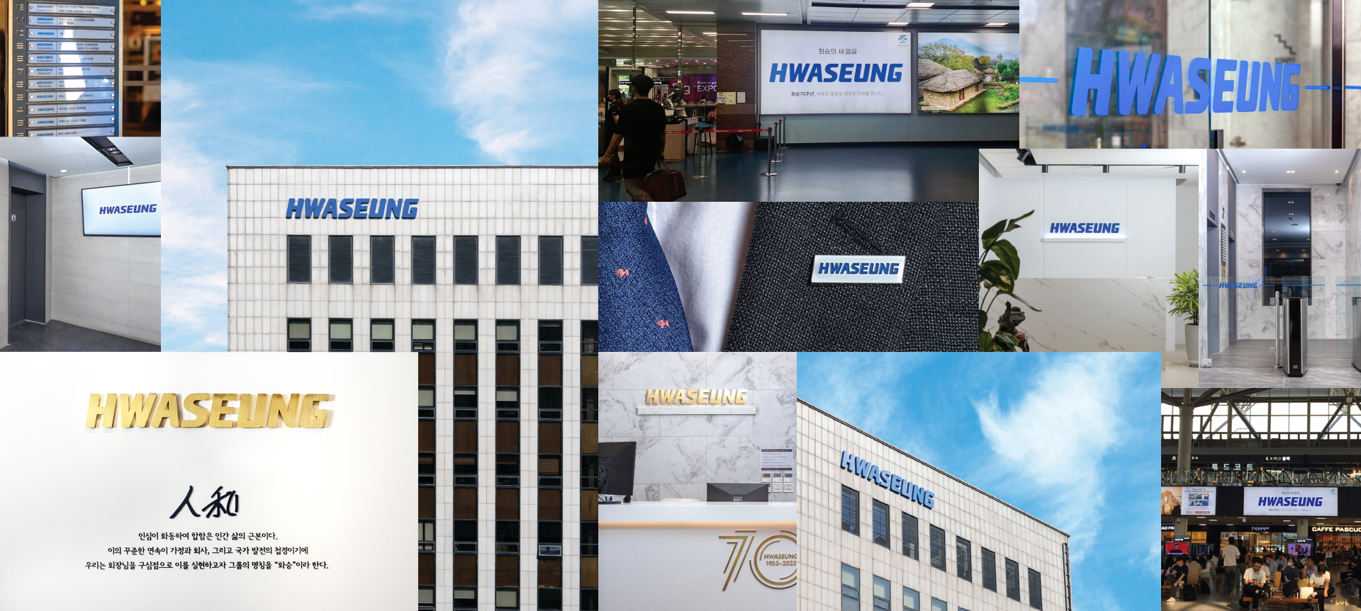
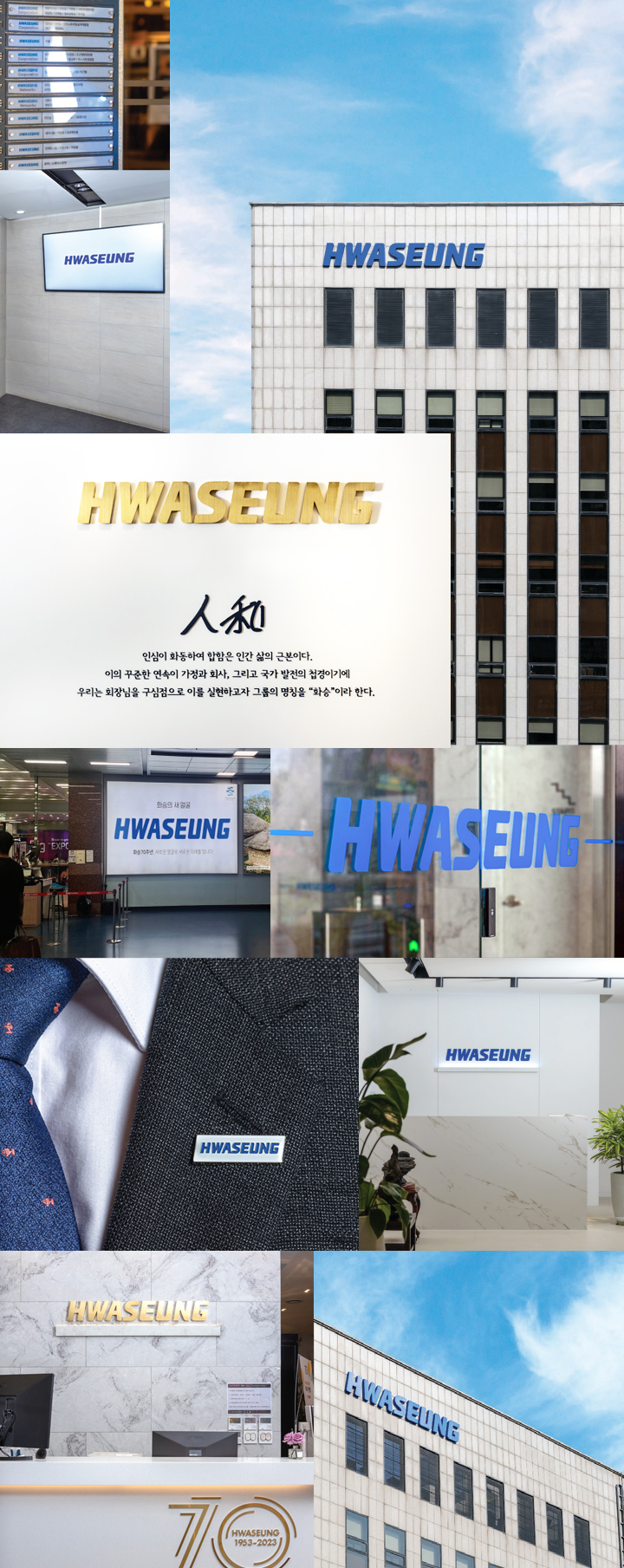
Hwaseung's latest Corporate Identity, themed around 'Harmony', incorporates the color 'Blue Star' symbolizing an enduring collaboration towards harmony. The Blue Star, gleaming in the world's most favored color, symbolizes a creative, adaptable, and nurturing entity that fosters connections among people, imbuing a sense of security and trust.
increases the value of Hwaseung
Hwaseung's latest Corporate Identity, themed around 'Harmony', incorporates the color 'Blue Star' symbolizing an enduring collaboration towards harmony. The Blue Star, gleaming in the world's most favored color, symbolizes a creative, adaptable, and nurturing entity that fosters connections among people, imbuing a sense of security and trust.
visualizing with Gothic
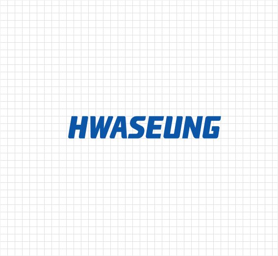
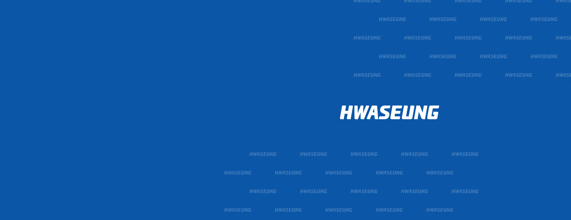
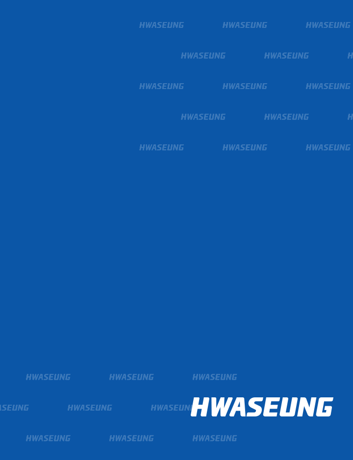
The new corporate identity (CI) encompasses a design philosophy that eliminates decorative elements, effectively showcasing the core of Hwaseung's identity in a clear and direct manner. The English company name "Hwaseung" features capitalized letters and a gothic typeface with bold strokes, visually representing the reliability and technological identity of Hwaseung. In contrast, "Mungjo" utilizes a larger and bolder font style without (Sans) Serif inflections.
visualizing with Gothic
The new corporate identity (CI) encompasses a design philosophy that eliminates decorative elements, effectively showcasing the core of Hwaseung's identity in a clear and direct manner. The English company name "Hwaseung" features capitalized letters and a gothic typeface with bold strokes, visually representing the reliability and technological identity of Hwaseung. In contrast, "Mungjo" utilizes a larger and bolder font style without (Sans) Serif inflections.